Microsoft unveiled a brand-new company logo last Thursday and I wonder why. Rather than the familiar banner of colored squares, the new logo is a static colored square composed of four evenly sized squares and a common typeface, slightly tweaked. (more…)
Archive for the ‘Branding’ Category
Why did Microsoft unveil a new logo?
Monday, October 22nd, 2012What’s the Value of Facebook? Three perspectives, all related.
Thursday, May 17th, 2012Facebook had 901 million monthly active users at the end of the first quarter this year. That’s impressive.
Let me focus on three issues: Tomorrow’s IPO, the Branding/Advertising platform and Business Strategy. I wear three hats: Investor, Branding Consultant and Business Strategist. (more…)
Amateur logo design?
Saturday, November 26th, 2011I got a question from Noël Gilkey in my post about appropriate logo design and the NFLs Houston Texan’s logo. He thought the Texan’s logo looked, well…“odd.” When the Texans (more…)
CBS radio interview on marketing and branding.
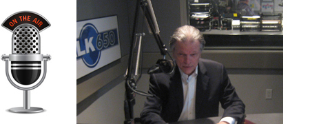
Thursday, June 9th, 2011Steven Sessions was invited to be interviewed by Chris Kelso on Talk Radio 650AM in Houston Texas to discuss Marketing. This is the full transcript of the live broadcast on June 8, 2011.
(Welcome to “The Price of Business,” I’m your host Chris Kelso, we appreciate your tuning in to “Talk 650” powered by CBS radio, right now, someone I really, really want to talk to is Steven Sessions with the Sessions Group – Steven how you doing?) “Good Chris, thank you for inviting me.”
(Let me ask you to tell our listeners (more…)
When is an American Patriot not red, white and blue?
Monday, March 21st, 2011This weekend in the NCAA March Madness Tournament, Ohio State played a team from George Mason: The “Patriots.” I was watching the game with friends and was not familiar with George Mason, and well, I felt a bit “un-patriotic” betting against the Patriots. But I lost that guilty feeling as soon as (more…)
Logo design as a wasted asset, sadly is now appropriate.
Tuesday, December 28th, 2010Feeling dazed or confused, or being stunned or knocked out after getting hit in the head, is typically communicated visually by a “halo” of twittering birds or twinkling stars orbiting the head at or above eyebrow level as with Sylvester the Cat above. Sometimes (more…)
GAP’s new logo design mistake.
Friday, October 22nd, 2010On October 4, 2010 the Gap quietly introduced a new logo on their website. A curious initiative to be sure. There are excellent reasons for , but none of them applied to the situation at the Gap. The result was the Gap’s worst nightmare.
According to company spokesperson Louise Callagy, (more…)
When does redesigning a logo make sense?
Thursday, August 26th, 2010
The Girl Scouts organization is now over 30 years old. That may explain why the iconic logo has gone under the knife. But was it a good idea? When does make sense? And in the Girl Scout’s case, (more…)
Rebranding an organization which has a distinguished history.
Monday, July 19th, 2010
Branding has been shown to be a very effective activity in an organization’s efforts to increase its influence in a marketplace. This increased influence equals increased sales, increased awareness, increased understanding, increased margins, increased business valuation, etc. And this strategy is as effective for non-profit organizations as it is for companies.
The Young Men’s Christian Association is a charity well known by its initials, YMCA. And as is popular in the marketplace, names are shortened in common use. Jennifer Lopez is known as J-Lo. And the Young Men’s Christian Association has for years been known as the “Y.”
Now the Young Men’s Christian Association has formally dropped those four descriptive words in favor of the single letter “Y.” And they have modified the visual identity and logo as well. Is this a good idea? The short answer is (more…)


