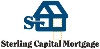


Our logotype combined with our Logo
Single line Logotype combined with our Logo
Our Logotype
Our logo is our symbol and our logotype is our signature.
As with our logo, repeated, consistent use will establish it as an immediately
recognized signature representing those qualities that comprise who
we are and what we mean to customers, vendors and employees. Consistent
use is absolutely critical. Inconsistent use will undermine the effort
to create an immediately recognized identity and will hinder our efforts
in the marketplace.
As a graphic when not part of a body of text, there are two ways to
display our logotype: one line or three lines. The font is Clearface
Black. The three line version has zero leading. The preferred color
for the logotype is 100% black. Download logotype files from our download
page to insure correct spacing, etc.
Shown below is the preferred way to display our logotype:
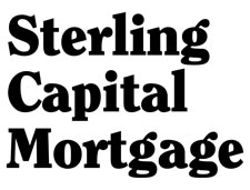
Shown below is the alternate one line way to display our logotype:

Our
Logotype combined with our Logo
Our logo is our symbol and our logotype is our signature. And it is
desirable to display them together.
The logo and logotype combined become an important, single unit in establishing
our identity in the marketplace – especially in new markets. Use
them together whenever possible, and with the three line logotype as
shown below. Shown here are three preferred combinations with their
associated alignments. Three more secondary possibilities are further
down on this page. Remember to allow the minimum clear space around
the logo when using them combined.
The logotype color is 100% black when combined with either a Pantone
541, Pantone 877, or 100% black logo. It reverses in white when combined
with a logo reversing in white (when reversing out of the same color
background).
In some instances, when used separately from the logo, the logotype
may be used in 100% Pantone 541 or Pantone 877.
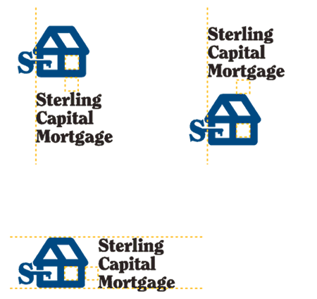
Single
line Logotype
combined with our Logo
Alternate examples of proper use when combining the logo to a one line
logotype.
When using the logotype in one line, the logo should be sized so that
the “S” on the logo is either the same size as, or twice
the size of, the “S” in the logotype.

"S" of
logo and logotype are the same in the examples above and below:

"S" of
logo is twice the size of the "S" in the logotype in the example
shown below: