

Space around the
Logo
Determining margins
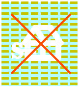
Improper use
Improper use of the elements of our Identity
Improper use of our logo and/or logotype undermines
our efforts to create a powerful and distinctive visual identity in our
marketplace. Do not add special effects
to the logo such as blur, skew, compression, elongation, Adobe PhotoShop
filter effects, etc. Following are some other
specific examples of improper use.
Do not condense, stretch, rotate or
elongate the logo or the logotype.


Do not use colors for the logo or
logotype other than
Pantone 541, Black or White.


Do not combine the logo or the logotype with a background that
interferes with legibility.

![]()